


Landing Page Deep Dive: How SocialPilot Converts Visitors into Leads

Let’s take a break from our usual psychological principles and do a landing page analysis this time.
The landing page plays an equally important role in turning website traffic into leads.
In this post, we’ll take a closer look at SocialPilot’s landing page to assess how well it engages visitors and encourages conversions.
We’ll be using a framework that evaluates key elements of landing page effectiveness:
Relevance (Ad Scent): Is the messaging consistent from the ad to the landing page?
Alignment (Awareness Level Match): Does the page match the user's knowledge and needs?
Incentives (Strengthens Motivation): Are there compelling reasons for the user to take action?
Clarity (Answers Crucial Questions): Does the page clearly explain the product and how it helps?
Streamline (Reduce User Friction): Are there obstacles that might slow down or stop the conversion process?
Guidance (Clear Path to Conversion Goal): Is the path to conversion smooth and obvious?
Let’s dive into SocialPilot’s landing page and see how it performs on these fronts.
SocialPilot Landing Page Overview
Before we break down the key elements, let’s briefly describe the landing page we’re analyzing.
Page Goal:
The landing page we’re reviewing focuses on converting traffic into free trial sign-ups. SocialPilot is a social media management tool designed for small to medium-sized businesses, agencies, and enterprises. The landing page seeks to showcase the platform’s ease of use, efficiency, and affordable pricing.
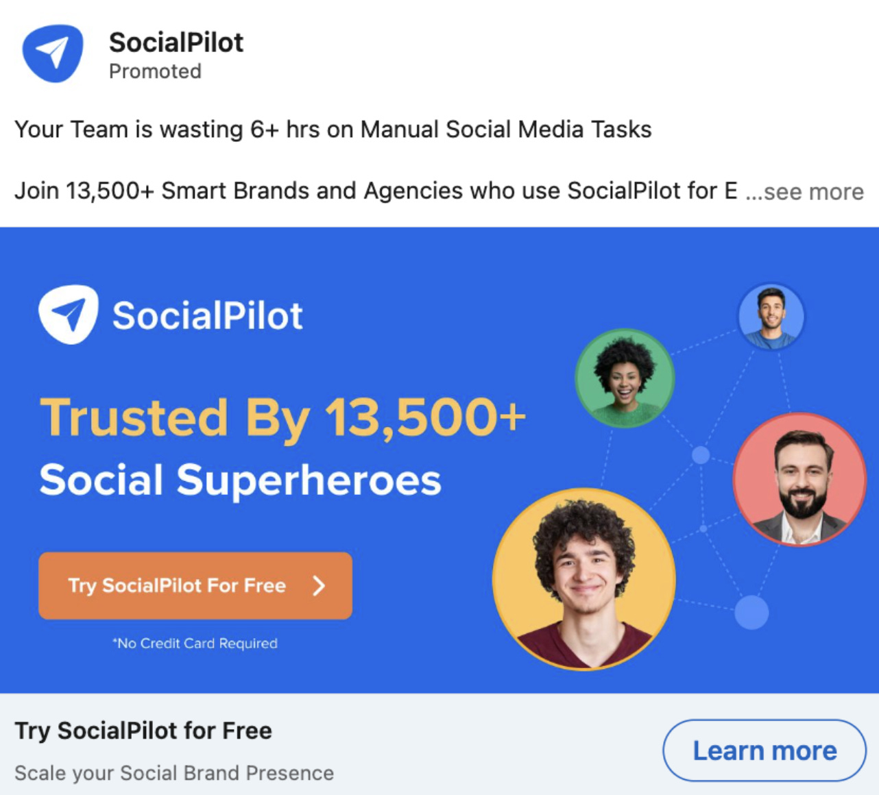
Social Pilot’s ad copy and creative:
The landing page after clicking the Learn More button:

1. Relevance (Ad Scent)
What is Ad Scent?
"Ad scent" refers to the consistency between the ad that brought the user to the page and the content they see once they arrive. If a user clicks an ad promoting a free trial for a social media management tool, the landing page should immediately reinforce that promise. Any disconnect between the two can cause confusion and lead to a higher bounce rate.
Ad Copy: Focuses on saving time for teams spending 6+ hours on manual social media tasks, highlighting trust from 13,500+ brands and offering a free trial with no credit card.
Landing Page: Continues the time-saving theme through AI-powered tools for social media scheduling and automation.
Evaluation: Strong ad scent, both ad and landing page emphasize time-saving, automation, and free trial.
2. Alignment (Awareness Level Match)
Understanding Awareness Levels:
Every visitor comes to a landing page with a different level of knowledge. Some may know little about the product, while others may already be familiar and ready to sign up. It’s important that the landing page content aligns with these different awareness levels, offering enough explanation for newcomers while also appealing to those ready to convert.
Ad Copy: Targets users aware of the pain point (manual social media tasks), suggesting they are problem-aware or solution-aware.
Landing Page: Appeals to solution-aware users, detailing features like AI assistance and a 14-day trial.
Evaluation: Good alignment, with the page providing features and benefits for users ready to decide.
3. Incentives (Strengthens Motivation)
What Motivates Users?
Visitors need strong reasons to take the next step, whether that’s starting a free trial or requesting a demo. Incentives like free trials, discounts, risk-reducing guarantees, and compelling value propositions strengthen their motivation.
Ad Copy: Promotes a free trial with no credit card required.
Landing Page: Reinforces the free 14-day trial and highlights key features and social proof, motivating conversions.
Evaluation: Effective use of testimonials, awards, and no-risk free trial to lower resistance.
4. Clarity (Answers Crucial Questions)
What Questions Do Users Have?
A landing page should quickly and clearly answer the user’s most important questions:
What is this product?
How does it help me?
How do I get started?
Ad Copy: Promises time savings but lacks specifics.
Landing Page: Details features (AI, pricing tiers) and answers key questions like trial terms and commitment.
Evaluation: Answers most questions but could further clarify how SocialPilot stands out from competitors.
5. Streamline (Reduce User Friction)
What is User Friction?
Friction refers to anything that slows down or stops the user from converting. Common examples include long forms, confusing navigation, or unclear instructions.
Landing Page: Clean structure, simple forms, and prominent CTAs. No unnecessary information required for the free trial.
Evaluation: Low friction, clear plan comparisons, and no credit card needed, making it easy for users.
6. Guidance (Clear Path to Conversion Goal)
What is Conversion Guidance?
Clear guidance means leading the user through a smooth journey toward the conversion goal, whether it’s signing up, purchasing, or scheduling a demo. The path should be intuitive and distraction-free.
Landing Page: Logical flow from problem introduction to features, social proof, pricing, and CTA.
Evaluation: Smooth progression with clear, repeated CTAs.
Final Thoughts on SocialPilot’s Landing Page
Strengths:
Strong consistency between the ad and landing page (excellent ad scent).
Low friction with a simple, intuitive design.
Solid use of social proof and a risk-free trial offer to motivate users.
Areas for Improvement:
Emphasize Differentiation: SocialPilot should focus more on what makes it the best choice for saving time. While the page explains the time-saving benefits, stronger emphasis on its unique advantages (e.g., "Why SocialPilot over other tools?") would enhance its appeal.
Address Pain Points Emotionally: The landing page could benefit from highlighting specific pain points—such as the overwhelm of manual social media posting—to build a stronger emotional connection with users.
Boost Urgency: Adding time-sensitive incentives or fast-track benefits could further drive conversions by encouraging users to act quickly.
SocialPilot’s landing page performs well overall, effectively guiding users toward a free trial with minimal friction. Small improvements in differentiation and emotional appeal could elevate its conversion potential.